How I published my first photography zine
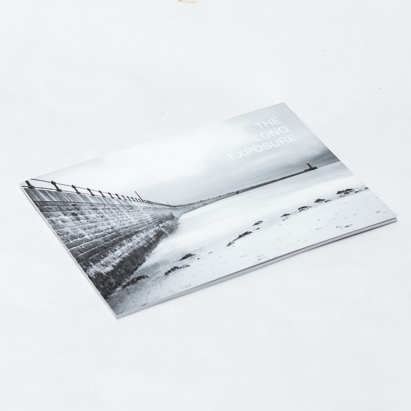
I recently took the first daunting steps to publishing a photography zine.
For a very long time I have had the urge to produce a photography book. The dream has always been, a big, chunky table book. Big ambitions, so best start slightly smaller!
Photography zines. What is a photography zine? You may ask.
A photography zine is generally a small (pages, and dimensions), self-published, magazine style book. As well as photographs, it can often contain descriptions, notes, musings, poetry, basically any written text the author feels may add to the theme or scope of the published work. A zine will generally be a single, limited print run.
The zine which first peaked my interest was ‘Parklife‘ by photographer Amar Sood (Web: https://amarsoodphoto.com/ Twitter: @asPhotoUK). Amar has crafted a beautiful, mist themed exploration of local parks. The images are beautiful, calming, and wonderfully curated. If there are copies still available, get in touch with Amar and add it to your shelf.
I spoke many times with Amar, and he was extremely generous in offering helpful tips and pointers on where to start in zine creation.
Taking onboard Amar’s advice, I went away and investigated, software and printing companies.
The Printer.
By no means was my search or investigations into printing companies, exhaustive. I looked at a few to see which offered the most guidance and best pricing for my budget, who were based in the UK. In the end I chose to go with Mixam.
The Mixam website is simple and easy to navigate and provides excellent guides on how to build a PDF for printing, explaining in easy to understand language all of the important printing terminology.
Mixam also allowed me to order a sample pack of printed materials prior to ordering. This arrived with a day or two, and contained various paper weights and sample leaflets, and a booklet. This is an important step as it allows you to see what different papers feel like, and the effects of matt, gloss and silk finishes. If your chosen printer has samples available, do please partake.
Using the Mixam quote calculator I went through various combinations of paper size, pages, paper weights, bindings, covers, finishes until I was happy with the intended build. At this point I had the information I would need to build the PDF to fulfil the order.
The Plan.
The choices I made for ‘The Long Exposure’ zine were as follows
Copies: 20 – I wanted a small limited run, having never done anything like this before, would anyone want one?
Size: A5 – The most common size for small, photography zines.
Sides: 24 (not including cover) – 24 sides ended up being the minimum pages for use with ‘Perfect’ binding (see below).
Orientation: Landscape – Vast majority of the images are landscape orientation.
Paper Weight: 200gsm – from 170gsm upwards is thick enough so that print will not be visible through the paper, and I wanted the pages to feel like a photograph.
Ink: Black – The work will all be monochrome so I did not require full colour CMYK printing.
Cover:
Sides: 4 – This is the minimum, consists of Front, Inside Front, Inside Back and Back Cover.
Paper Weight: 350gsm – I wanted the cover to have a thicker, book cover feel.
Binding: Perfect – You can staple also but I wanted to have a book spine for a cleaner final product.
Ink: Black – As previous, no colour required
Spine: 3mm – Perfect edging produces a flat spine which can also be printed on with an extra supplied PDF.
Building The PDF.
Taking the knowledge from the Mixam quote. I knew that I needed to build an A5 – 28 page (24 + 4 cover) PDF to supply to Mixam to print.
First I needed some software to build the PDF. I looked at the available commercial offerings such as Adobe InDesign, Affinity Publisher, and a few others. I then looked for an open source offering (Being a software developer with my other hat) and discovered the product Scribus
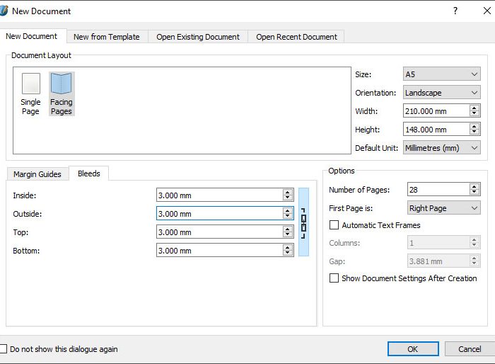
I downloaded and installed Scribus and set to work. Opening Scribus, I chose New, and picked A5, landscape, 28 pages and 3mm bleed (This is the area that may be cut when the document is printed, you can read about this in Mixam’s guides). Document Layout as Facing pages and First Page as ‘Right’. Click Ok and you will have your empty zine!
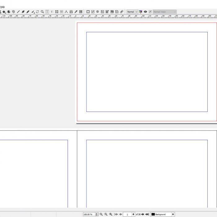
The book is laid out as you would imagine. Page 1 is the front cover, Page 2 is the inside of the front cover. Pages 3-26 are your 24 sides. Page 27 is the inside back cover and finally page 28 is the back cover.
It would be exhaustive to copy the entire Scribus manual into this article, but I will point out a few basics of the layout system.
The first important thing to note, the bleed area. This is the black line just in from the edge of the page. Any content you place over this line, may or may not be cut when the zine is put together. You should class that line as the edge of your page. If you want to print your photograph right to the edge of the page with no white around it, then do stretch your images here. This will generally always be the case for the cover page and back page if you want a full size cover.
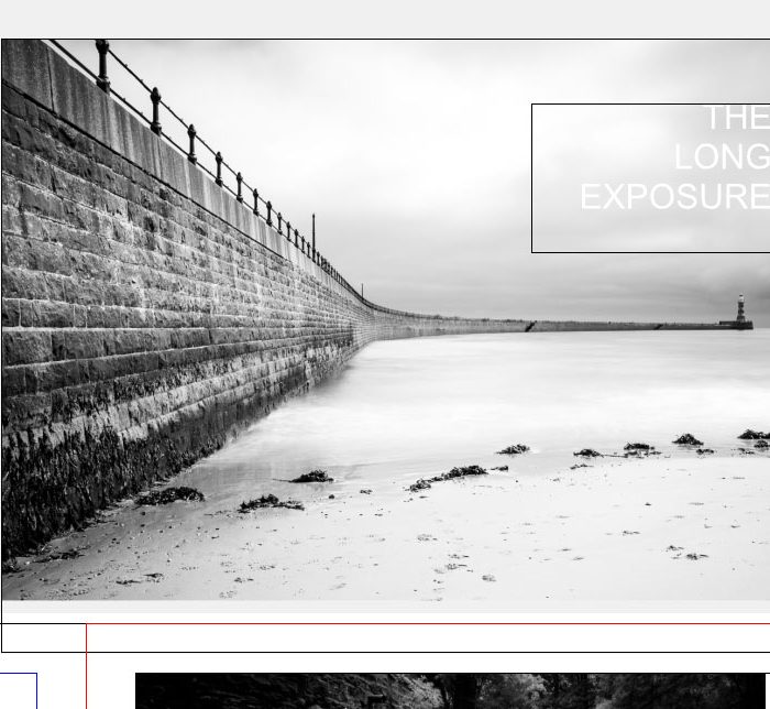
Content is placed onto the pages by choosing the image frame or text frame icons from the toolbar and dragging the frame to size on the page. Scribus includes lots of page layout templates which you can utilise to produce your final look.
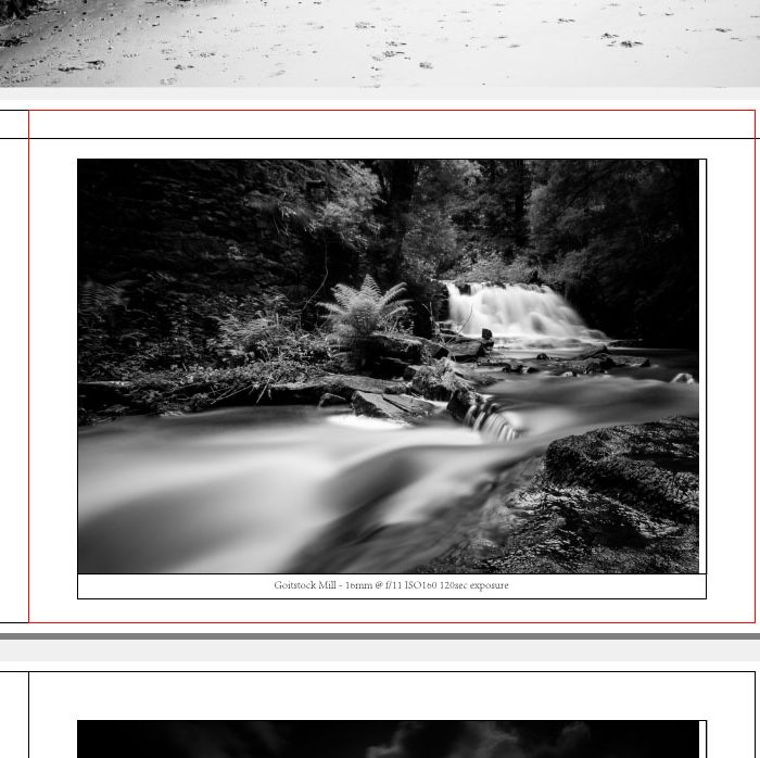
In my own case I opted for single photographs, centrally on each page, snapped to the example blue, guides. I then dragged a text frame below each photograph, and centred the text to provide and area for the image descriptions.
As I had chosen ‘Perfect’ binding for the final product I had the ability to provide a second PDF which would be printed on the spine. The dimensions for this PDF were given to me in the Mixam wizard. I returned to Scribus and in the New dialog entered the exact dimensions as supplied, it was the standard height of an A5 document and 3mm in width (zine is very thin!).
This gave me a very tall, thin PDF. I added a text box and rotated in 90 degrees to the text read top to bottom.
Preparing the PDF.
When you have built your PDF. Save it, and go away for a few hours.
Why did we leave it? You’ve been staring at it for ages while building it, if you proof it straight away you WILL NOT spot any mistakes. You need to come back fresh and read it through a few times. I did this twice. Both times I found typos.
When you are absolutely satisfied that it’s correct, it’s time to export it.
Disclaimer! From this point, this info is purely for guidance and you must check with your printer for their up to date guidance on their own print requirements (I can’t be held responsible for any mistakes!)
From File > Document settings, I changed the document layout back to single page view.
I then proceeded to File > Export > Save as PDF
The only changes I made to the defaults. Compatibility, I set to the latest PDF version (1.6). Colour Tab, Intended for Printer.
Save.
Sending to the printer.
Heading back to Mixam, I went back through the quote calculator, built up my requirements and uploaded the completed PDF.
From this point, I followed Mixam’s wizard. They automatically produced a PDF proof and an interactive view of the completed booklet. This allowed me to see if everything was as expected.
If you are happy with everything, you pay, then you panic.
Well, that’s what I did for a few days. Will it print correctly? Did I make any typos? Did I make it the wrong size? Did I accidentally order 4000!
The final product.
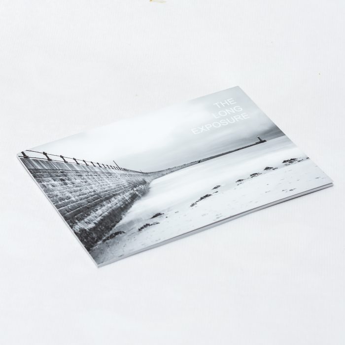
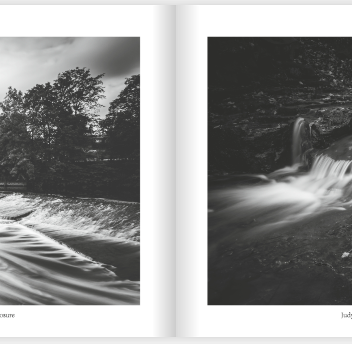
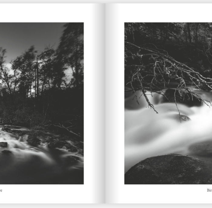
A neat little cardbox arrived by courier after 2-3 days. It worked, I’d done it, an actual photography zine in my hands!
I have to say, it felt good. I’d produced something, I didn’t really care if anyone else would like it, I was quite proud of my small achievement.
The Long Exposure Zine and my 2nd Zine Trees – a photographic exploration are available to purchase.
I hope this little guide is of some use to other photographers out there who are thinking of taking the leap into self-publishing. Drop a comment below or get in touch on Twitter @shutterspot

A good overview of the process – something I’m keen to try one day!
I hope it is of some help when you do decide to publish.
I look forward to seeing what you create.
Thank you so much for sharing this. Very educational as well as inspirational.
More than welcome, I hope it was useful.
Hi – very good article. I received a few proof copies back yesterday of a black and white zine I’m working also using Mixam who I use for colour newsletters. To try and get rich blacks I went for full colour (CMYK) printing – the images do look good but I do have a few with slight colour casts. I think eliminating these is going to be beyond my knowledge of CMYK publishing so I was interested to see that you had your zine printed in black and white only – presumably you were happy with the blacks so I think I’ll give that a try.
Hi Dean,
Thanks for the positive feedback. I definitely found Mixam to be an excellent print provider and the final quality of the product was exceptional, better than I could have hoped for.
Kind Regards
Gary