Chiaroscuro and Architecture
I’ve always held a deep fascination with Black and White / Monochrome photography. Something happens when a photograph is presented as black and white, without the distractions and emotional ties of colour.
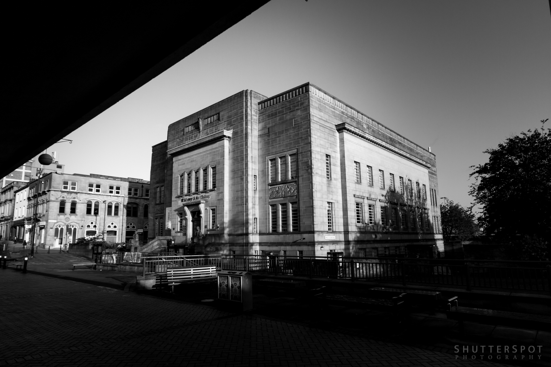
Monochrome works exceptionally well in portraiture, drawing the viewer in, letting them see the subject clearly. I find that the same can be said for architectural photography. Remove the colour from urban and architectural photography and you gain an unobstructed view of the myriad angles and shapes.
The classical term ‘Chiaroscuro’ best defines the effect being brought into play.
The term chiaroscuro originated during the Renaissance as drawing on coloured paper, where the artist worked from the paper’s base tone toward light using white gouache, and toward dark using ink, bodycolour or watercolour.[7][8] These in turn drew on traditions in illuminated manuscripts going back to late Roman Imperial manuscripts on purple-dyed vellum. Such works are called “chiaroscuro drawings“, but may only be described in modern museum terminology by such formulae as “pen on prepared paper, heightened with white bodycolour”.[9] Chiaroscuro woodcuts began as imitations of this technique.[10] When discussing Italian art, the term sometimes is used to mean painted images in monochrome or two colours, more generally known in English by the French equivalent, grisaille. The term broadened in meaning early on to cover all strong contrasts in illumination between light and dark areas in art, which is now the primary meaning.
In my own black and white photography I always to try and push that high contrast style in camera, or in post-processing if the light at the time of the shot wasn’t as contrasting as I would have liked.
Going out in the early hours when the sun is low in the sky provides excellent opportunities for deep shadows and bright surfaces. Here, a set from an early morning in Huddersfield, capturing the wonderful architecture on offer.
[rl_gallery id=”16931″]